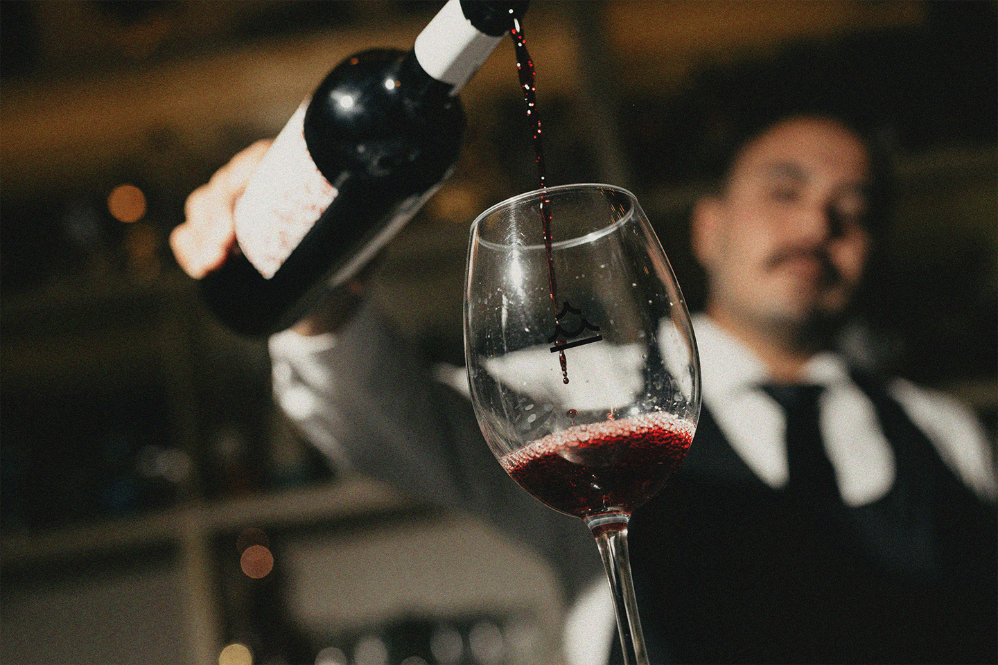
Working for a multi-concept restaurant in New Jersey - where a cigar lounge, a Mediterranean kitchen, and a steakhouse share one space, one name, and one mark.
Category:
Branding & Web Design
Client:
La Fontana Family @BR/Bauen
Location:
New Jersey, US


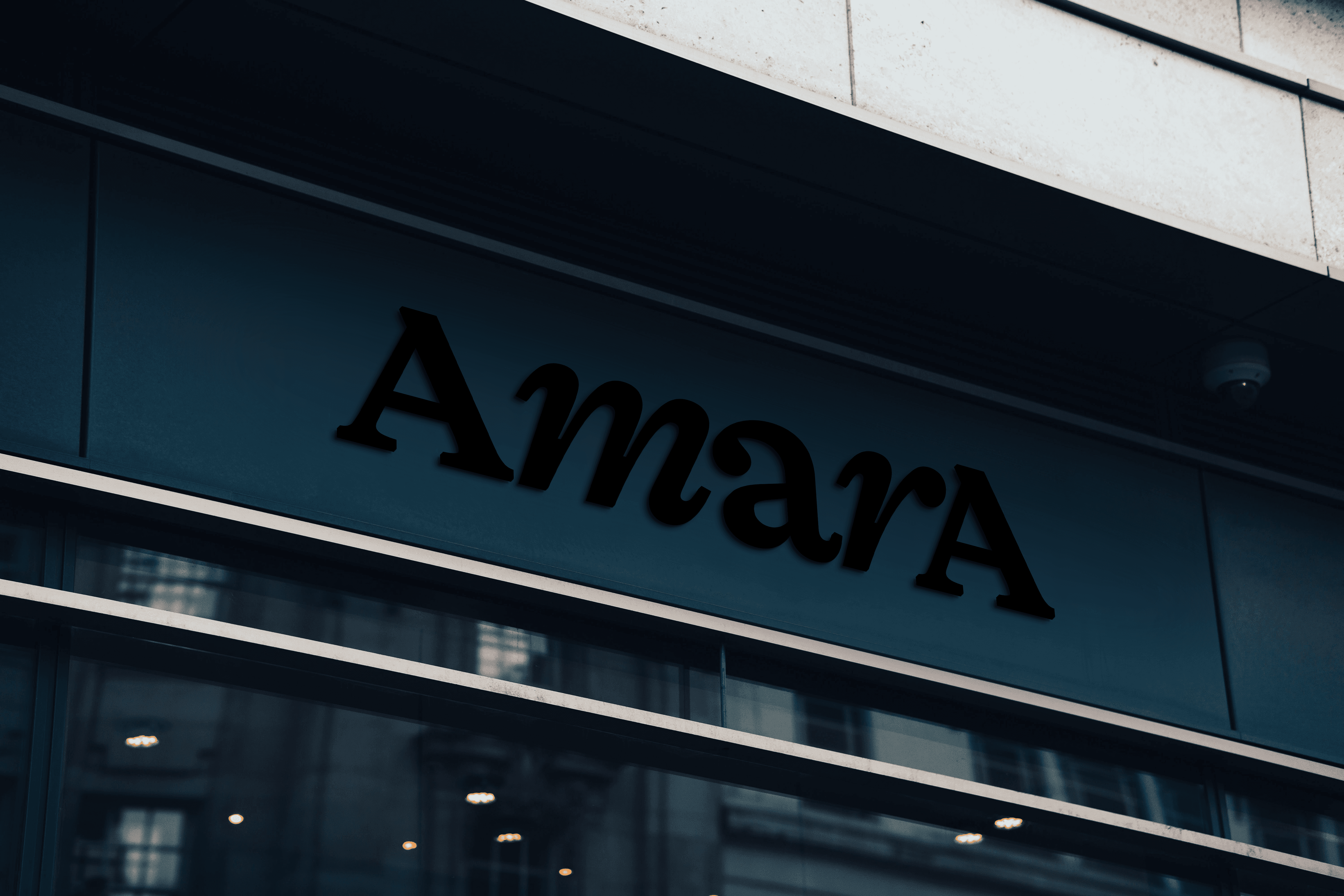
Three meanings, one mark.
Amara holds three distinct spaces: a steakhouse, a Mediterranean kitchen, and a cigar lounge. The symbol was built to hold all three at once.
Read from bottom to top: a baseline representing earth, two arches for the sea, and a final arch reaching toward fire. Three elements. Three environments. One mark.
The result is immediate and recognizable - a symbol with visual weight, scalable presence, and quietly, almost by accident, the shape echoes the letter A itself.

Mix & match.
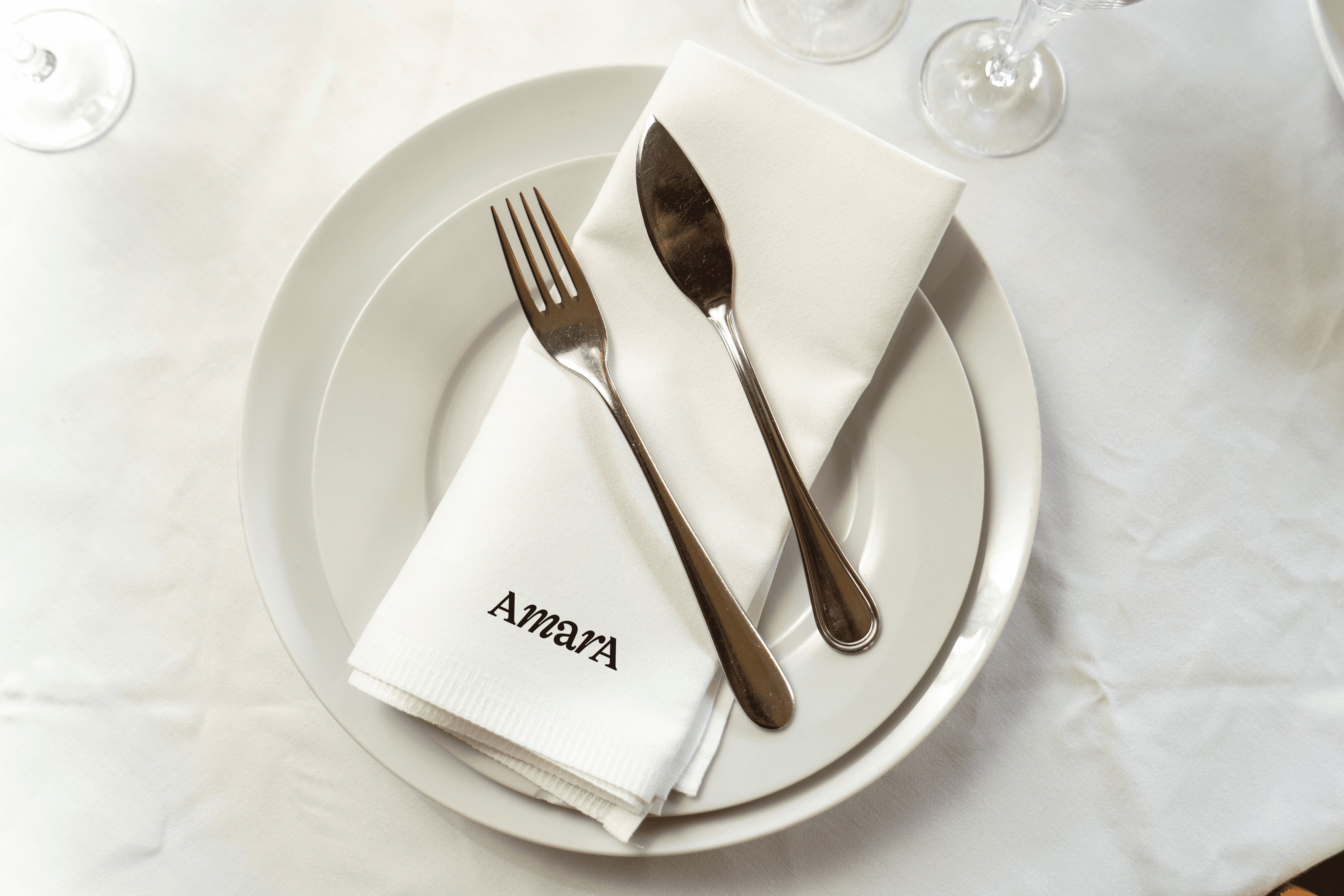
The wordmark uses a serif typeface with refined proportions. But the real decision was in how to set it.
Uppercase at both ends, lowercase in the middle - AmarA. The mix of roman and italic cuts creates a rhythm that feels both structured and alive. Sophisticated, but not rigid.
A single word that already tells you everything about the place.