Brand identity for a Brazilian telecom startup built to argue with its own category.
With Rodrigo Francisco, Arthur Abreu, Antônio Delatore & Ted Oliver.
Category:
Branding
Client:
Nomo @BR/Bauen x CUTS®
Location:
São Paulo, Brazil
Recognition:
Logotype, TDC/Bronze, LAD

A name that pushes back.
Nomo means no more. The name was the strategy before anything else existed - a four-letter refusal aimed at a category trained to overpromise and underdeliver.
Telecom doesn't usually start with a stance. This one did. Everything that came after (the mark, the motion, the color) had to inherit the same posture: confident, direct, openly tired of how things are done.
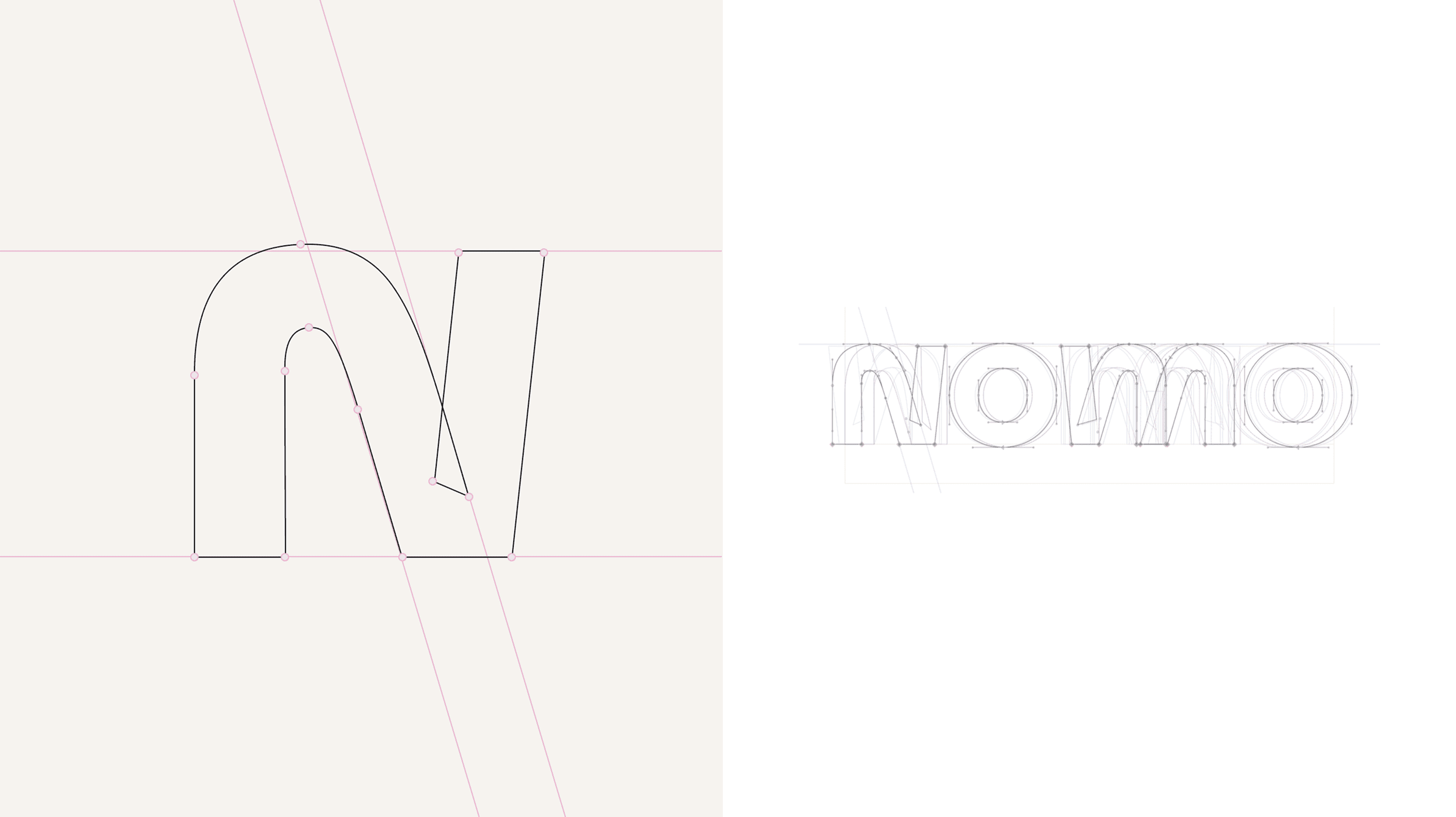

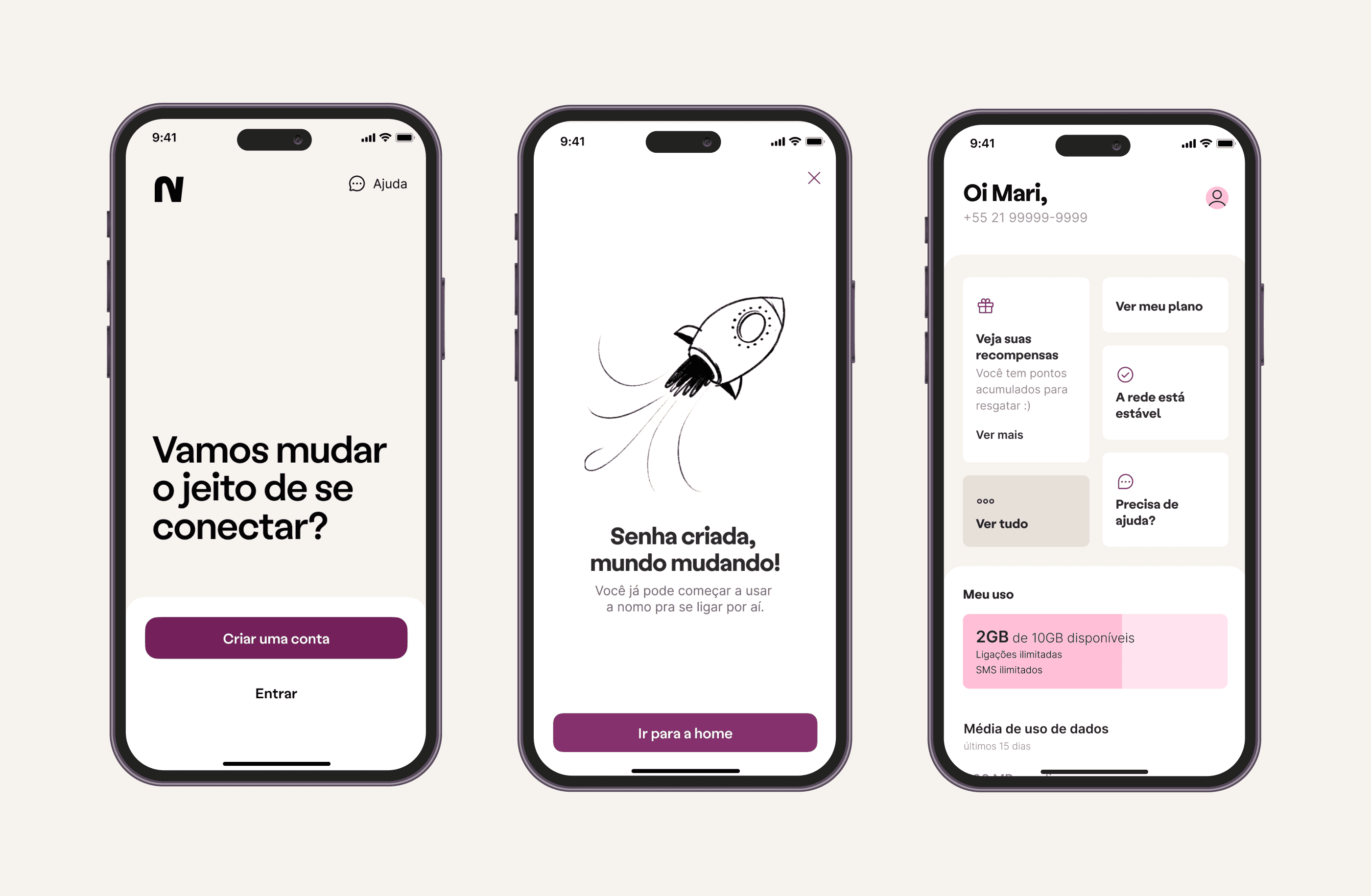
Change, made visible.
"Change is about constant movement." That single line set the rule for how the identity behaves.
The mark wasn't designed to sit still. It shifts, rearranges, and restates itself - kinetic by construction rather than animated as an afterthought. Motion lives inside the logo, not on top of it. The wordmark is legible static, but the brand only becomes fully itself when it moves.
A system built to be remembered the way you remember a gesture: by how it changes.
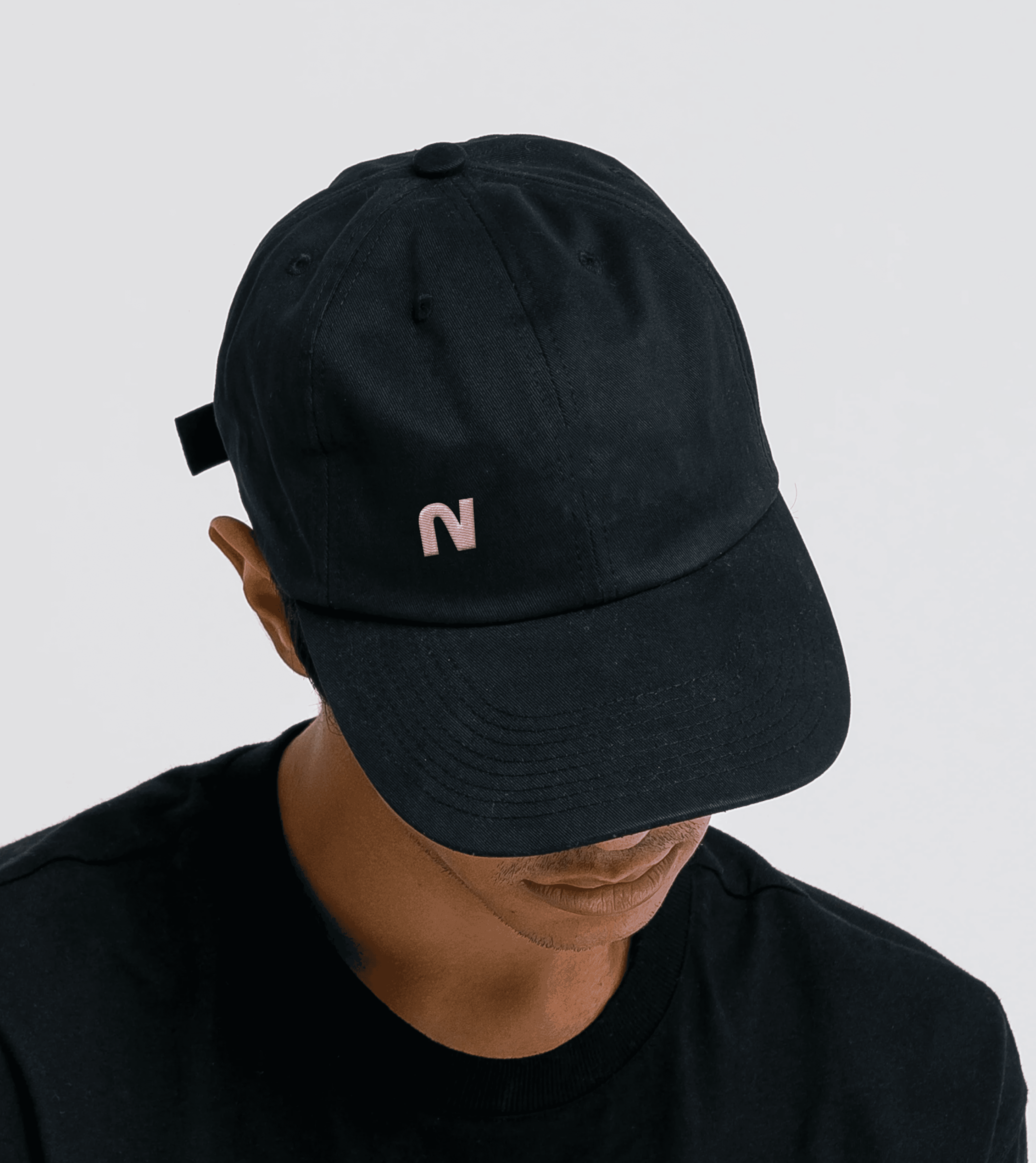
Pink with intend.
The category defaults to blue, red, orange. Nomo went pink - saturated, unapologetic, chosen precisely because it doesn't belong in this conversation.
Set against deep black and clean white, the pink works as a signal, not a backdrop. The typography is tight and direct, the layouts breathe instead of crowd, and every touchpoint carries the same tone: immediate, present, refusing to whisper.
In a category trained to look serious, Nomo looks like it actually means it.